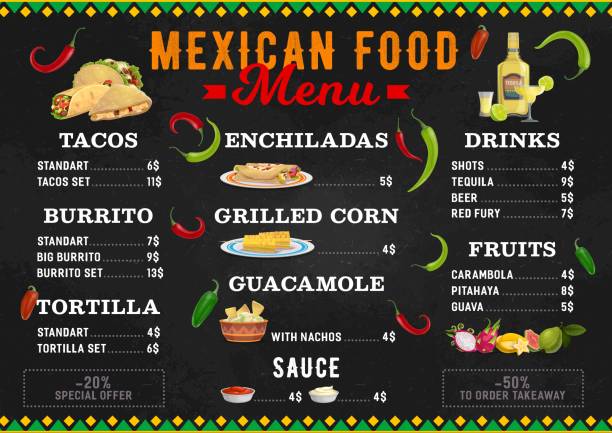
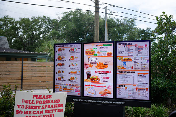
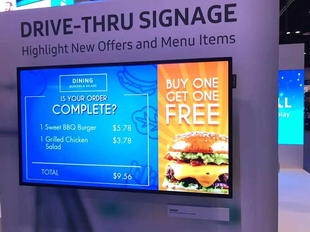
The best digital menu design helps customers understand what you sell, find what they want, compare options, and make a decision without unnecessary scrolling or confusion. Use clear categories, readable typography, strong visual hierarchy, focused food photography, concise descriptions, visible prices, strategic recommendations, dietary labels, and consistent layouts. Then test performance and update the menu based on real customer behavior.
Key Takeaways
- Design for fast scanning, not maximum information.
- Use clear categories and predictable navigation.
- Make menu readability a priority on every screen size.
- Highlight bestsellers and high-value items strategically.
- Keep descriptions concise but useful.
- Use food photography selectively rather than filling every space with images.
A digital menu should do more than display food and prices. It should help a customer move from “What do you have?” to “I know what I want” with as little friction as possible.
That is why the best digital menu design is not necessarily the most colorful, animated, or feature-packed. It is the design that makes information easy to understand at the exact moment a customer needs it.
For restaurant owners, this distinction matters. A visually impressive menu can still perform poorly if customers cannot quickly locate categories, understand descriptions, compare options, or identify what the restaurant recommends.
Here are 10 practical design principles that can help create a faster, clearer ordering experience.
1. Build the Menu Around How Customers Decide
Customers rarely read a restaurant menu from top to bottom. They scan it, identify familiar categories, notice appealing items, compare prices, and narrow their choices.
Your digital menu should therefore reflect the decision-making process rather than simply copying a printed menu onto a screen.
Start with a logical structure such as:
Featured or bestselling items
Starters
Main dishes
Sides
Drinks
Desserts
Specials or limited-time items
For restaurants with larger menus, add filters or search functionality where appropriate.
The objective is simple: reduce the number of decisions a customer has to make before finding a suitable item.
2. Prioritize Menu Readability Over Decoration
Excellent menu readability is fundamental to fast ordering.
A customer should not have to squint, zoom, or move closer to a screen to understand the menu.
Use:
- Clear, highly legible fonts
- Strong contrast between text and background
- Consistent font sizes
- Adequate spacing
- Short descriptions
- Distinct headings
- Easily identifiable prices
Avoid placing detailed text over busy food photography. Decorative fonts may look attractive in branding materials but can become difficult to read when customers are standing several feet away from a display.
A useful readability test
View your menu from the distance at which customers normally encounter it.
If you cannot quickly identify the category, item name, price, and primary callout, the design probably needs simplification.
3. Create a Clear Visual Hierarchy
A customer should immediately understand what is most important on the screen.
Visual hierarchy tells the eye where to look first, second, and third.
For example:
BESTSELLER
Grilled Chicken Bowl
Roasted chicken, seasonal vegetables, house dressing
$14.95
The product name should be more prominent than the description. A promotional label should attract attention without overwhelming the actual menu item.
Use differences in:
- Size
- Weight
- Spacing
- Position
- Contrast
- Image scale
This creates a natural viewing path.
A strong digital menu layout does not force every item to compete equally for attention.
4. Use Food Photography Strategically
High-quality food photography can make a digital menu more appealing, but showing a photograph beside every item is not always the best approach.
Too many images can make a screen feel crowded and reduce the visual importance of individual dishes.
Instead, use photography to emphasize:
- Signature dishes
- Bestsellers
- Meal combinations
- Seasonal specials
- High-margin items
- New products
For example, a burger restaurant might feature one large image of its signature burger at the top of the screen, followed by a clean list of related menu options.
The image creates attention; the surrounding information helps complete the decision.
5. Write Descriptions That Answer the Customer’s Questions
A menu description should provide enough information to help customers decide without becoming a paragraph of marketing copy.
Instead of:
Classic Pasta
Try:
Creamy Garlic Chicken Pasta
Grilled chicken, parmesan, roasted garlic, and herbs tossed with penne.
The second version quickly answers important questions: What is it? What protein does it contain? What flavors should the customer expect?
Good descriptions should communicate:
- Main ingredients
- Key flavors
- Protein or primary component
- Preparation style when relevant
- Important dietary information
Keep the language natural. Customers want clarity, not exaggerated claims.
6. Make Prices and Options Easy to Compare
Price visibility is an important part of menu usability.
Customers should not need to search around the screen to determine how much an item costs.
Keep pricing visually associated with the correct item and maintain consistent formatting throughout the menu.
For customizable items, clearly explain additional costs.
For example:
Build Your Bowl — $12.95
Add chicken +$3 | Add avocado +$2 | Add extra cheese +$1.50
This approach makes the ordering decision easier because customers can understand the base price and potential additions immediately.
If prices change regularly, digital menus also provide an operational advantage: restaurant teams can update displayed pricing without redesigning and reprinting physical boards.
7. Use Menu Design Psychology Without Manipulating Customers
Menu design psychology is essentially about understanding how visual presentation influences attention and decision-making.
The goal should not be to trick customers. It should be to make useful choices easier.
Strategic techniques include:
Highlight Recommendations
Use labels such as:
- Customer Favorite
- House Specialty
- Chef’s Pick
- New
- Seasonal
These labels provide context when customers are unsure what to choose.
Group Complementary Items
A main dish can be presented alongside relevant sides or beverages.
Create Clear Choice Sets
If your restaurant offers several similar products, organize them in a way that makes differences obvious.
For example:
Option | Best For | Price |
|---|---|---|
Classic Burger | Simple choice | $10.95 |
Signature Burger | House specialty | $13.95 |
Double Burger | Larger appetite | $15.95 |
The customer can compare options without opening several separate screens.
8. Design for the Actual Screen and Ordering Environment
One of the biggest digital menu mistakes is creating one design and using it everywhere.
A wall-mounted menu board, drive-thru display, tabletop screen, and QR-code menu have different viewing conditions.
Menu Type | Design Priority |
|---|---|
Counter display | Fast scanning |
Drive-thru board | Large text and rapid comprehension |
Dining-room display | Visual appeal and promotions |
QR/mobile menu | Touch-friendly navigation |
Tabletop display | Detailed information and customization |
Food truck | Compact layout and high visibility |
Screen orientation and viewing distance should also influence the design.
A menu intended to be read from several feet away needs substantially different information density from a menu viewed on a customer’s phone.
9. Reduce Friction With Useful Digital Features
Digital menus can do more than replicate printed menus.
Depending on the restaurant’s technology setup, useful features can include:
- Search
- Category filters
- Allergen information
- Dietary labels
- Item customization
- Order buttons
- Promotional banners
- QR-code access
- POS integration
- Real-time content updates
- Scheduled promotions
The important principle is usefulness over novelty.
Do not add an animation simply because the platform allows it. Every interactive element should make browsing, understanding, or ordering easier.
For example, a vegetarian filter can be genuinely useful. A constantly moving background may simply distract customers.
10. Measure, Test, and Improve the Menu
A digital menu should not be treated as a finished graphic.
Restaurant owners can learn from customer behavior and continuously refine the experience.
Monitor questions such as:
- Which items receive the most attention?
- Which products are frequently ordered?
- Where do customers stop browsing?
- Which promotions perform well?
- Are customers frequently asking staff for information already shown on the menu?
- Are certain items repeatedly unavailable?
- Do customers struggle to find particular categories?
You can then make controlled improvements.
For example, if customers frequently overlook a signature dish, consider improving its placement, image, description, or labeling.
If customers repeatedly ask whether a dish contains a particular ingredient, make that information more visible.
The best menu design evolves with actual customer behavior.
Best Digital Menu Design: A Practical Example
Consider a quick-service restaurant with 40 menu items.
A cluttered screen might show all 40 products simultaneously, each with a photograph, lengthy description, price, and multiple icons.
The customer has too much to process.
A better structure could be:
Screen 1: Featured meals + top sellers
Screen 2: Burgers
Screen 3: Chicken and vegetarian options
Screen 4: Sides and drinks
Screen 5: Desserts + limited-time promotion
Each screen has a clear purpose.
The customer can identify the category, scan the available options, understand prices, and move toward a decision without processing unnecessary information.
This is the fundamental principle behind effective digital menu layout ideas: make the next decision obvious.
Common Digital Menu Design Mistakes to Avoid
Even a modern digital display can create friction when the design is poorly planned.
Too Much Text
Long descriptions slow scanning and make screens feel crowded.
Tiny Fonts
A menu that looks fine on a designer’s monitor may be difficult to read from across a restaurant.
Too Many Images
Every image competes for attention. Use photography where it adds decision-making value.
Excessive Animation
Movement can attract attention, but too much animation can distract from menu information.
Poor Contrast
Low contrast can make text difficult to read, particularly under challenging lighting conditions.
Inconsistent Pricing
Different formats for prices make the menu look less organized and can make comparison harder.
Outdated Information
A digital menu that displays unavailable products or incorrect prices damages customer confidence.
Ignoring Mobile Users
If customers access the menu through QR codes, the mobile experience needs to be designed separately rather than simply shrinking a desktop layout.
Digital Menu Design Checklist
Before publishing a restaurant digital menu, check the following:
Checklist Item | Done? |
|---|---|
Categories are easy to understand | ☐ |
Menu text is readable from the intended distance | ☐ |
Prices are clearly associated with products | ☐ |
Descriptions are concise and informative | ☐ |
Bestsellers are clearly identified | ☐ |
Food images are high quality and relevant | ☐ |
Dietary and allergen information is clear | ☐ |
Promotions do not overwhelm the menu | ☐ |
Sold-out items can be removed or updated | ☐ |
Mobile layout works correctly | ☐ |
Screen-specific layouts have been considered | ☐ |
Content has been proofread | ☐ |
Links and ordering buttons work | ☐ |
Menu has been tested from the customer’s viewpoint | ☐ |
How Houston Dynamic Displays Can Help Restaurants
Creating effective restaurant displays requires more than putting a menu onto a screen. The content needs to work with the display environment, brand identity, customer journey, and operational requirements.
Houston Dynamic Displays provides digital signage solutions designed around business communication and restaurant display needs. Restaurant owners can use professional digital displays to present menus, promotions, featured products, and other visual content in a more flexible format.
For restaurants considering a move from static boards to digital displays, the right approach starts with the customer’s experience. Screen selection, content structure, visual hierarchy, readability, and update flexibility should all be considered together.
Expert Tips for Faster Ordering
If you want to improve your menu without completely redesigning everything, start with the changes most likely to reduce friction.
Remove unnecessary text. Keep only information that helps the customer decide.
Make your top products obvious. Customers should quickly identify what your restaurant recommends.
Improve contrast. Never sacrifice readability for visual styling.
Separate categories clearly. Make navigation predictable.
Use images selectively. Feature products rather than filling every available space.
Review the menu during peak hours. Watch where customers hesitate or ask questions.
Update content regularly. Remove unavailable items and keep seasonal promotions current.
Test on real devices. A design should work in the actual environment, not just on a design screen.
Keep mobile users in mind. QR menus require touch-friendly navigation and readable content.
Measure results. Use customer behavior and sales information to guide future changes.
Conclusion
The best digital menu design is built around one core objective: helping customers make confident decisions quickly.
A successful menu does not need to display everything at once. Instead, it organizes information logically, prioritizes readability, uses photography and visual hierarchy strategically, presents prices clearly, and gives customers useful information at the right moment.
Restaurant owners should also remember that digital menu design is not a one-time project. Menus change, customer preferences change, promotions change, and operational needs change. Digital displays provide the flexibility to respond to those changes, but the content still needs thoughtful planning and regular review.
For restaurants looking to create a clearer, more engaging digital menu experience, Houston Dynamic Displays can help develop a professional digital display approach suited to the restaurant environment.
Contact us today to explore digital menu display solutions and create a restaurant menu experience designed for clarity, engagement, and faster customer decisions.
Frequently Asked Questions
The best digital menu design is clear, easy to scan, visually organized, and adapted to the restaurant’s screen and ordering environment. It should make categories, item names, descriptions, prices, recommendations, and important dietary information easy to understand without overwhelming the customer.
Digital menu design can reduce decision time by organizing products logically, using readable typography, highlighting popular items, simplifying descriptions, making prices visible, and reducing unnecessary navigation. A clear hierarchy helps customers identify relevant options quickly.
Strong contrast, legible fonts, appropriate text size, sufficient spacing, short descriptions, and a clean background all contribute to menu readability. The design should also be tested from the distance and device customers will actually use.
No. Food photography can attract attention, but using too many images can make a menu visually crowded. It is often more effective to use strong photography for signature dishes, bestsellers, specials, combinations, or products you particularly want customers to notice.
Useful digital menu layout ideas include placing featured products prominently, grouping related items into clear categories, maintaining consistent pricing, limiting information density, using visual hierarchy, and adapting the layout to the screen’s orientation and viewing distance.
A digital menu should be updated whenever prices, availability, ingredients, promotions, or menu items change. Restaurants with frequently changing offerings can benefit from a system that allows content to be updated efficiently without rebuilding the entire design.